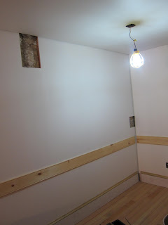
Believe it or not, there's a lot going on in this photograph of the new exhibit space:
 |
| This room will soon represent Caroline Schneider's kitchen |
The small rectangular cut-outs in the wall reveal snippets of the building's history; lines where partition walls once stood, and places where previous walls were attached to the brick structure. We use these "exposure windows" to give visitors glimpses of the building's past.
Why do we cover the brick at all? Though it's charming to the contemporary eye, exposed brick is very much a mid-to-late 20th century phenomenon. Originally, these spaces would have had painted plaster walls (just as the residential apartments upstairs did), so we're re-creating that aesthetic for "Shop Life".
The site of another big upcoming innovation also looks pretty humble these days:
 |
| The site of our future wheel chair lift |
We'll keep you posted with further updates as work progresses on our new exhibit.
-- Posted by Kira Garcia

No comments:
Post a Comment
Note: Only a member of this blog may post a comment.